About
About Me
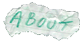
About This Site
Contact
|
 |
|
| |
|
About This Site
Basically, the idea for this site was to have somewhere to post up information about my various projects, since explaining them and generating one-off diagrams for people as I try to explain some idea or another to them was getting to be a pain. Also, with a few people in my broader (less nerdy) group of friends interested in the MP3 player project, I needed somewhere I could just post the updates and get them all to check in on. However, once I started this, it quickly grew into being a general (albeit very nerdy) site, where I wanted to cover other stuff, such as photography and other not-so-computer-oriented things, and maybe even put a general everyday blog in the mix... Anyway, I thought RobTheNerd.com was a rather appropriate name, and most people seem to agree!
|

|
|
|
|
| |
|
The Design
I was really making it up as I went along, playing with colours and layouts until I got something that was readable and didn't cause your eyes to bleed. I hate sites which depend on Flash, JavaScript, CSS and other things that people even now might not be able to use. They're fine for added content, but I want the site to be accessible by as many people as possible, and so this site, even though it uses JavaScript and CSS, is still usable even on the most basic of browsers.
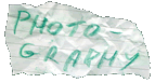
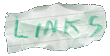
The idea for the graphics came from the notepad I was doodling site designs in. I had a list of links down the left and the title across the top, and so all I did was rewrite them in crayon pencil (thanks Sarah!), crumple the page, tear them out and scan them in. A huge amount of Photoshop wasn't necessary here - they're the real deal! As for the background, I just scanned a blank page from my trusty notepad and cut appropriate tiles which I then mirrored to give a seamlessly repeating pattern no matter how big the page gets. A carefully built table means it stays intact no matter what browser or what window size you use.
Finally, the "you are here" and section-subsection breadcrumb links are sort of necessary because there is such a deep hierarchy of information that it would look very messy - not to mention the size it would be - if it were to be all done in crayon buttons. It was also an exercise in "can I get it to work" as with different depths, different sublinks or groups are needed and the logic actually turned out quite complicated. But it works so far and makes it nice and easy to navigate, so I'm happy with it... For now.
|
|
|
|
|
| |
|
How It Works
Ah, the nitty gritty of it all. The backend was basically a bunch of PHP scripts which set up the template and loaded text files that determined the content. Since then however, the text files have been replaced with a database and an admin section has been added that allows the site content to be edited without messing with text files on the server. Still loads more to do, but at least now it should simplify things if I decide to change the look (which is probably overdue at this point).
|
|
|
|
|
| |
|
The Future
Eventually I plan to have a dynamically generating gallery I can just upload an image to, pick an album and let it do the rest. I'll also add a contact section and a public comment section (provided it doesn't get too abused!), and maybe even a mailing list for update notifications. Possibly might add thread comments for posts specific to a particular blog entry, project, article or whatever, or maybe even a full-blown forum. Who knows, maybe even a webmail @robthenerd service!
All far in the future anyway, given the teensy amounts of spare time I seem to have these days... Call back soon anyway and see how the site's coming on!
|
|
|
|